Visual Design
Visuals are a pivotal part of telling a story. They grab a viewer’s attention and guide them through the page in a seamless flow. The combination of images, text and graphics to create an engaging experience for users is something I strive for in every visual design I create.
Promotional Booklet: Eden Harbor Boats
During a Foundations of Communication Design course, I was tasked with designing a promotional booklet for a select company. The objective of this project was to combine learned skills in Photoshop, Illustrator, and InDesign to create a multi-page design. I was provided with content and image materials pertaining to the company chosen, Eden Harbor Boats. Additional images were sourced from a copyright free image website, Pexels.
The target audience intended for this design was middle-aged, wealthy adults. I aimed to communicate a lavish and relaxed lifestyle that is associated with the name Eden Harbor Boats. I redesigned the logo for the company and crafted spreads that displayed an array of content with an emphasis on a newly launched product, the New Harbor 21.
Multimedia Page Designs
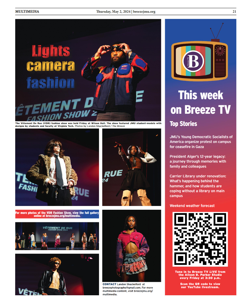
As part of my position as Photo Editor of The Breeze, I design weekly multimedia pages in each edition of the paper that showcase an event from the previous week within the JMU community. These are select designs throughout the year.
Kailey Garner, The Breeze
Year
2023-2024
Typographic Work
A project completed in a Foundations of Visual Communication Design class was centered around an introduction to working in Adobe Illustrator. I was tasked with creating a typographic poster based on a season with a quote and hand drawn elements. Being that summer is my favorite season, I quickly began brainstorming design ideas. I have always been fond of the beach and felt it represents summer perfectly. I found lyrics from the Beach Boys song “Surfin’ USA” and my vision for the poster began to formulate. I wanted to create writing in sand for the lyrics below ocean water. For the drawn elements, I decided to image trace a chair and recolor it and draw and image trace an umbrella sitting in a pile of sand to emulate a relaxing summer day. The elements placed above the lyrics creates the perspective of looking down at the sand from a bird’s eye view. I chose colors that were nostalgic and fit with the 60s lyrics and style.


